

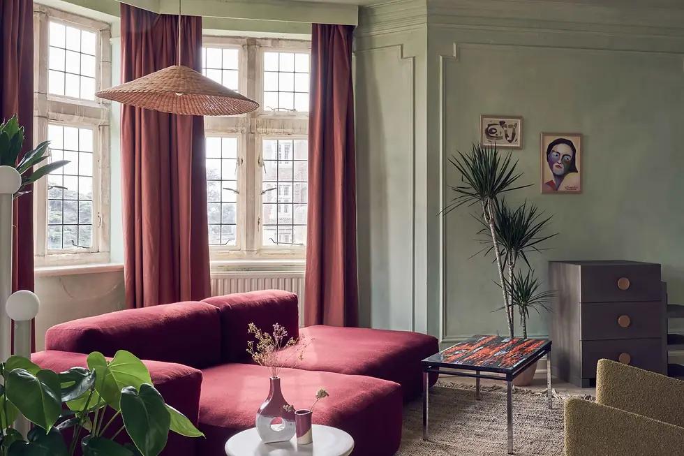
Interior Colour Trends 2026: A Return to Rich, Confident Palettes
Chocolate brown, muted greens, delicate yellows and expressive reds are creating a more distinctive approach to contemporary interiors.*
After years of restrained neutral palettes, colour is finding a more confident place in interior design.
The most interesting colour stories of 2026 are not necessarily bright or overwhelming. They are layered, nuanced and carefully balanced, offering spaces greater emotional depth without sacrificing sophistication.
From understated residential interiors to expressive hospitality environments, designers are exploring combinations that feel warm, individual and architectural.
Chocolate Brown: A New Foundation
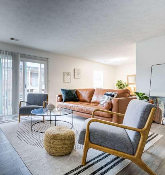
Chocolate brown has emerged as one of the defining colours of contemporary interior design.
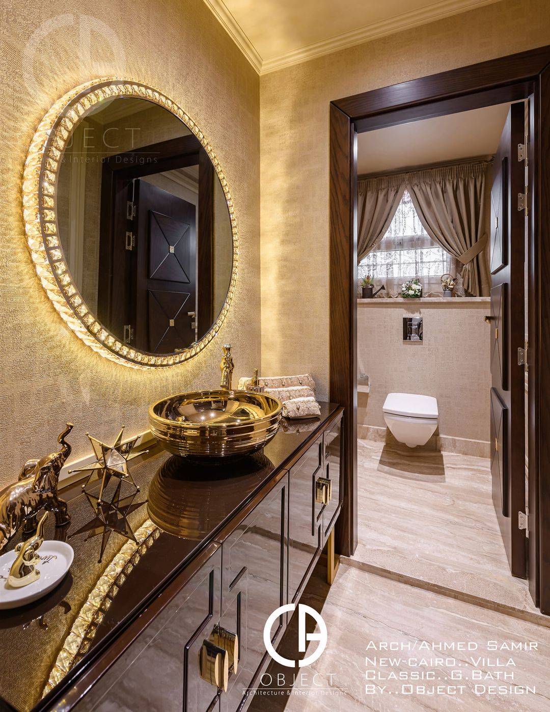
Its appeal comes from versatility. Dark timber furniture, brown leather upholstery and deep cocoa-toned walls can introduce richness while remaining remarkably adaptable.
Unlike cooler charcoal greys, brown establishes a natural connection with wood, stone and warm metallic finishes.
For an elegant living room, combine chocolate brown with ivory upholstery, limestone surfaces and brushed bronze details. The contrast creates depth without making the space feel overly formal.
Butter Yellow: A Softer Expression of Colour
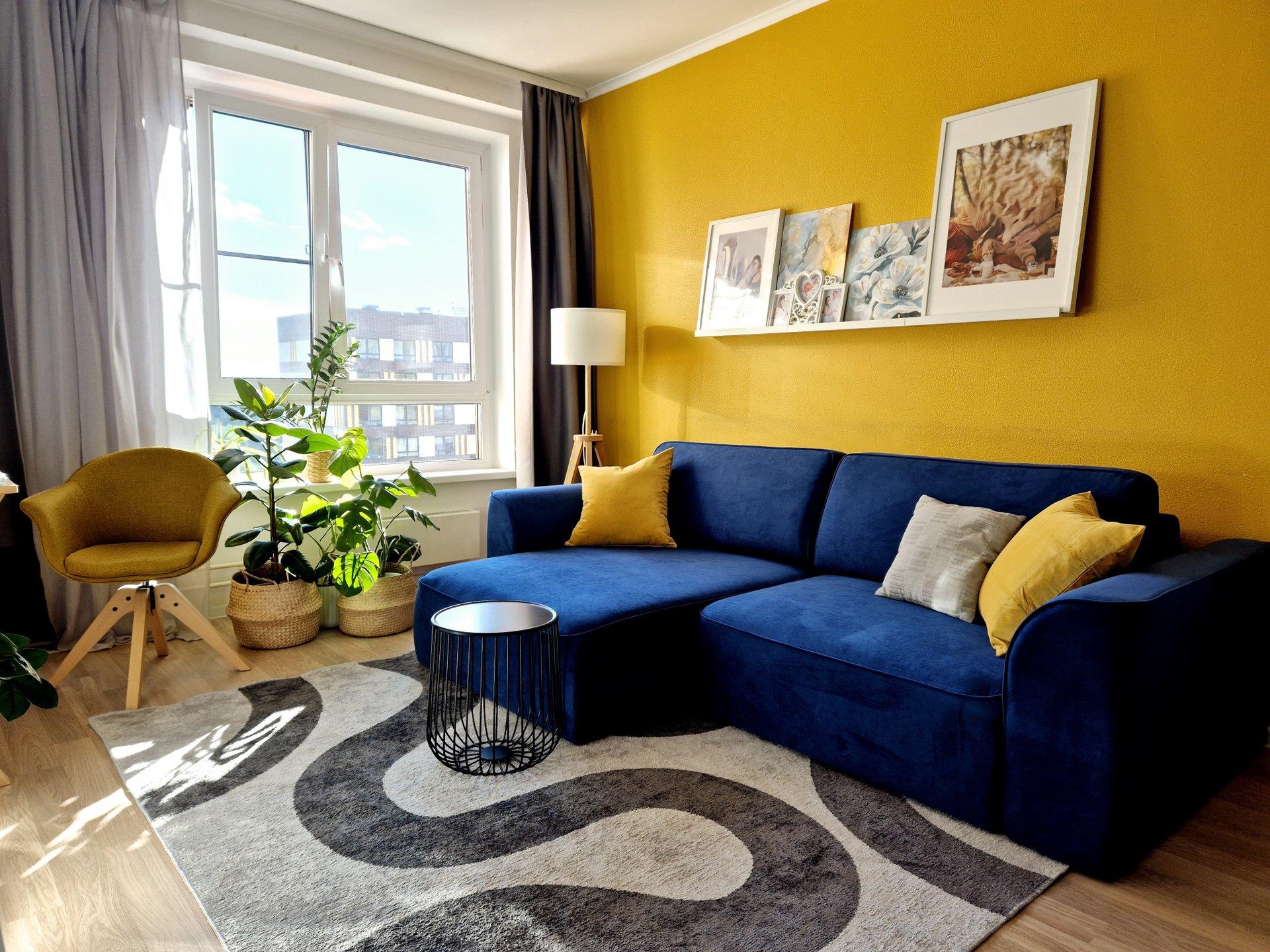
Yellow is returning in a quieter form.
Butter yellow offers warmth and subtle optimism, making it particularly attractive for rooms that benefit from a welcoming atmosphere.
It works well on painted joinery, upholstered seating and decorative textiles. Paired with walnut, cream or soft grey-green, it can create a sophisticated palette that feels contemporary rather than nostalgic.
The key is selecting a muted shade with sufficient depth. Highly saturated yellow can dominate a room, while softer variations become part of a balanced composition.
Pistachio and Muted Greens
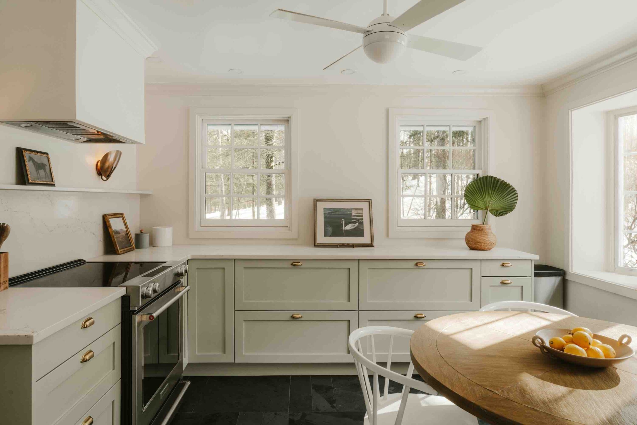
Photo: Clay Banks / Unsplash
Green continues to influence interiors, but designers are exploring alternatives to the familiar sage and olive palettes.
Pistachio, eucalyptus and softened botanical greens introduce freshness without requiring an overtly nature-themed interior.
These colours can be particularly effective in kitchens, bedrooms and informal living spaces.
Against pale stone, natural oak or off-white plaster, a green cabinet or upholstered chair becomes a quiet architectural statement.
Burgundy and Deep Red
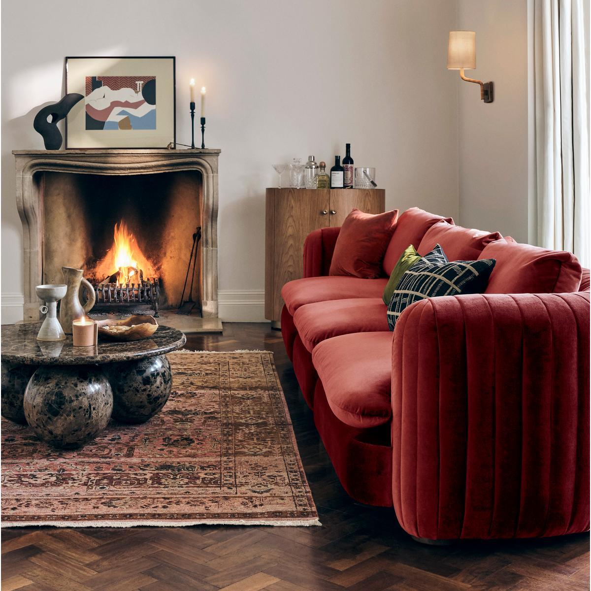
Photo: Erik Mclean / Pexels
For a more dramatic approach, burgundy brings intensity and warmth.
Used in lacquered furniture, velvet upholstery, decorative panels or selected walls, it creates an atmosphere of intimacy and refinement.
Burgundy works especially well with dark wood, aged brass and soft lighting. Rather than filling an entire room with red, designers can establish a single focal point and allow surrounding materials to balance its richness.
The Rise of Colour Drenching
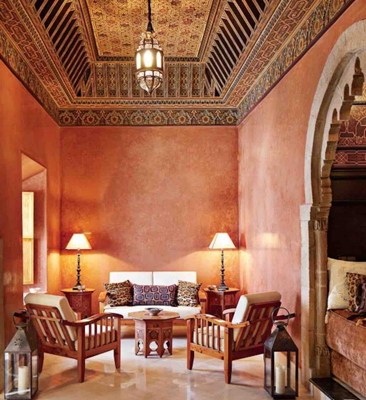
One of the most distinctive colour approaches in 2026 is colour drenching: applying closely related shades across walls, doors, trims and sometimes ceilings.
By reducing sharp transitions between architectural elements, this technique creates a cohesive environment.
A muted terracotta room, for example, can feel enveloping when its surfaces share similar tonal values but use different finishes.
In UAE homes, where daylight can be exceptionally strong, colour samples should be tested throughout the day. A shade that appears restrained under artificial lighting may look considerably brighter beside a large sun-facing window.
Colour With Purpose
The most successful interiors do not simply follow fashionable palettes. They consider natural light, room proportions, material finishes and the emotional atmosphere a space should create.
The colour trends of 2026 provide opportunities for greater individuality, but their lasting value depends on thoughtful application.
For Archinteriors Magazine, the emerging message is clear: sophisticated interiors are becoming more expressive, and colour is once again an essential part of their architectural identity.